Norwegian Public Roads Administration
Trafikk app Design System
A visual refresh and a shared design system for the Trafikk app, which brings critical road and traffic information to people across Norway.
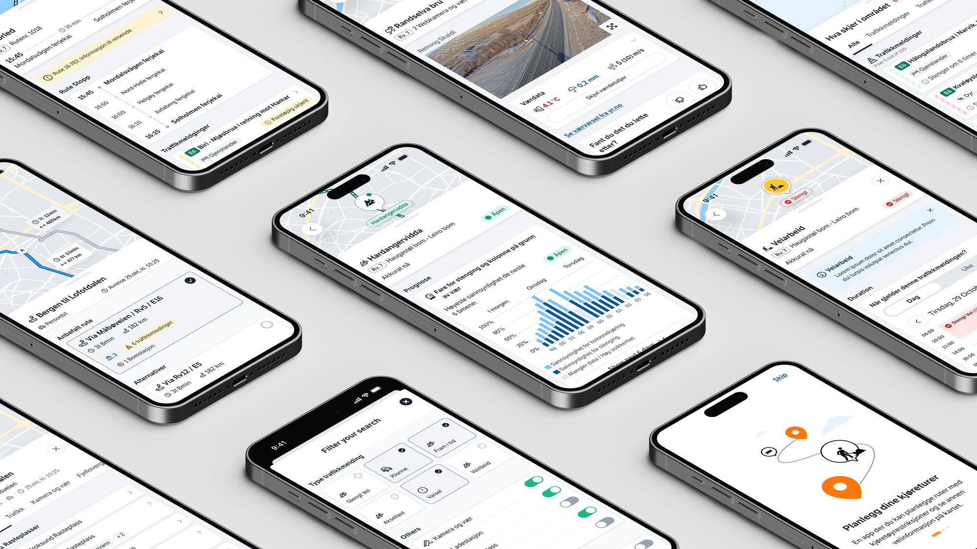
I worked with the Norwegian Public Roads Administration to make the app clearer, more consistent and more accessible, in both light and dark themes, with input from other designers, stakeholders and users along the way.
Background
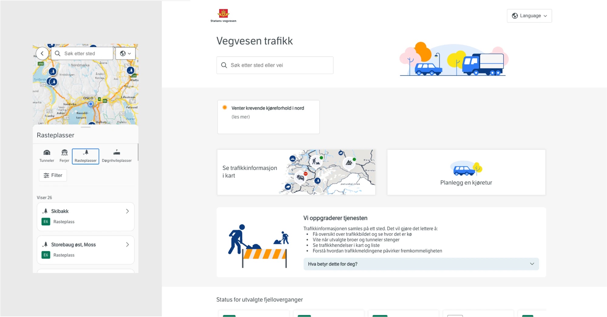
The Trafikk app communicates critical road and traffic information, where an unclear label or a low-contrast detail can make a journey less safe. Inconsistent components and fragmented patterns made the service harder to read and learn.
Night-time use was also common, but there was no dark mode. The goal was a visual refresh rooted in Norwegian simplicity, on a scalable and accessible foundation that works in any light.
How might we make critical road information easier to read, in any light and on every platform?
Process
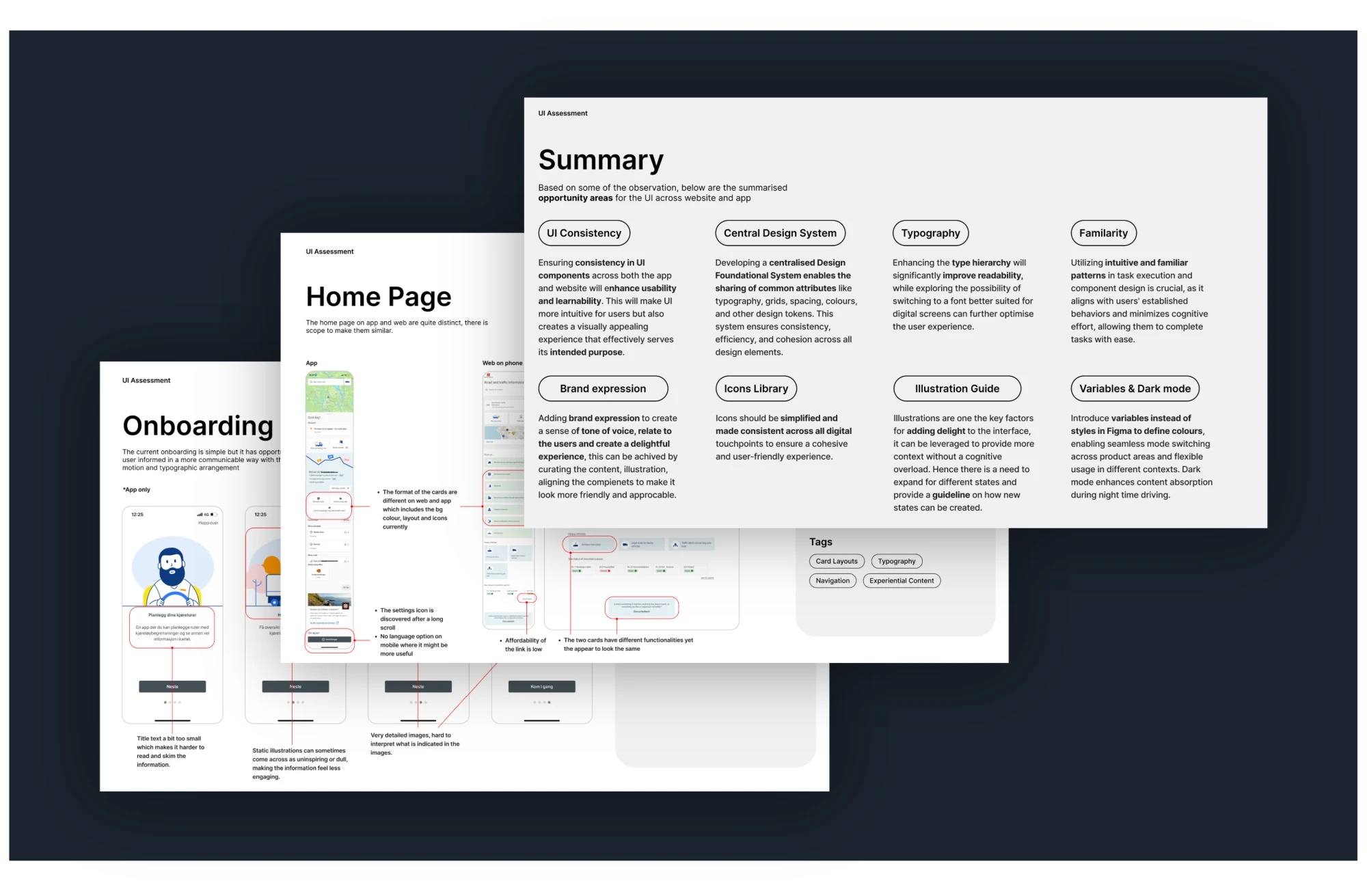
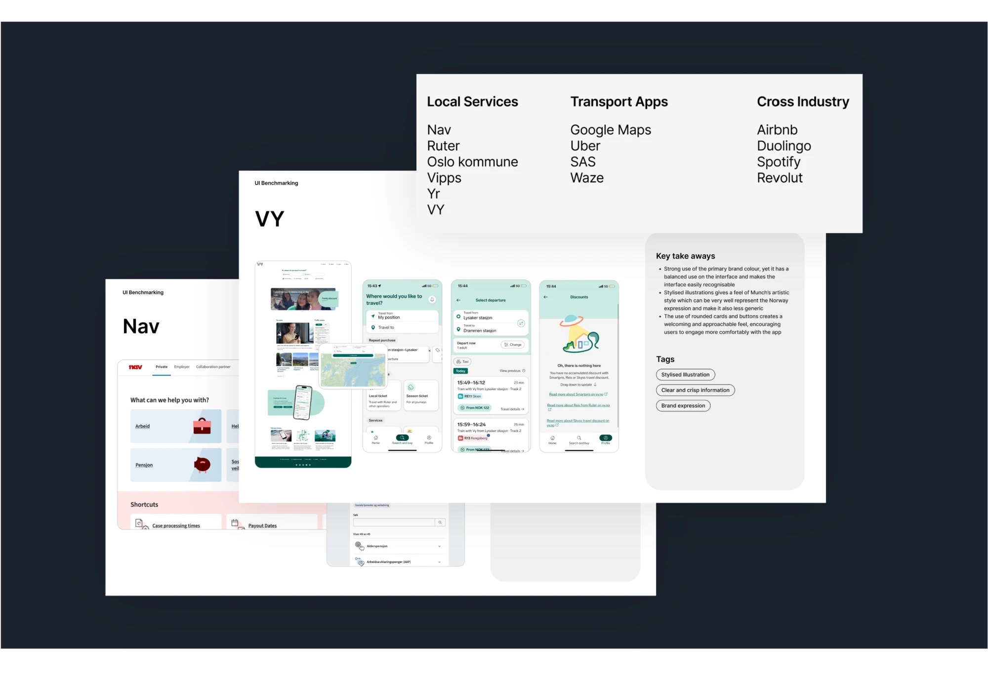
I started by analysing the current experience screen by screen, then benchmarked it against local services (Nav, Ruter, Oslo kommune, Vipps, Yr, VY), transport apps (Google Maps, Uber, SAS, Waze) and products from other industries (Airbnb, Duolingo, Spotify, Revolut).
Each review ended in key takeaways and tags such as clear information, type hierarchy and brand expression, which gave the team a shared vocabulary for what the new experience needed.
Visual direction
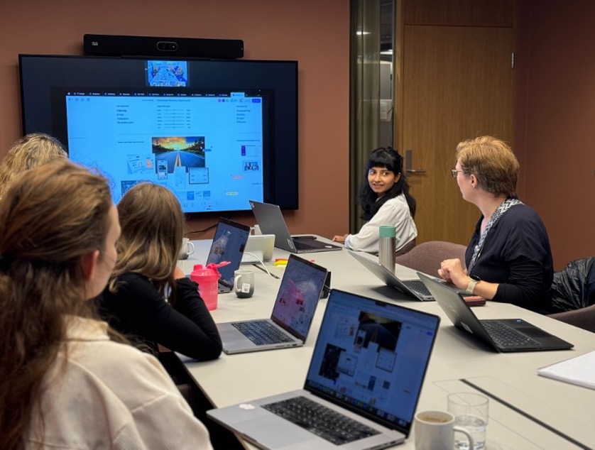
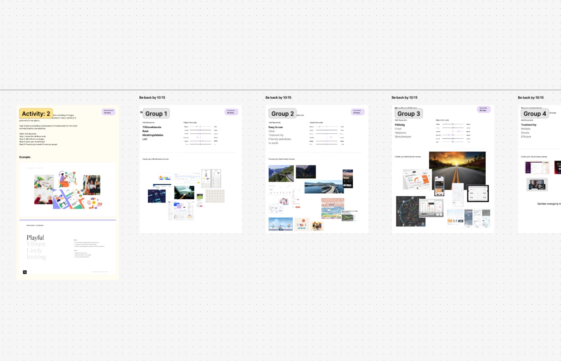
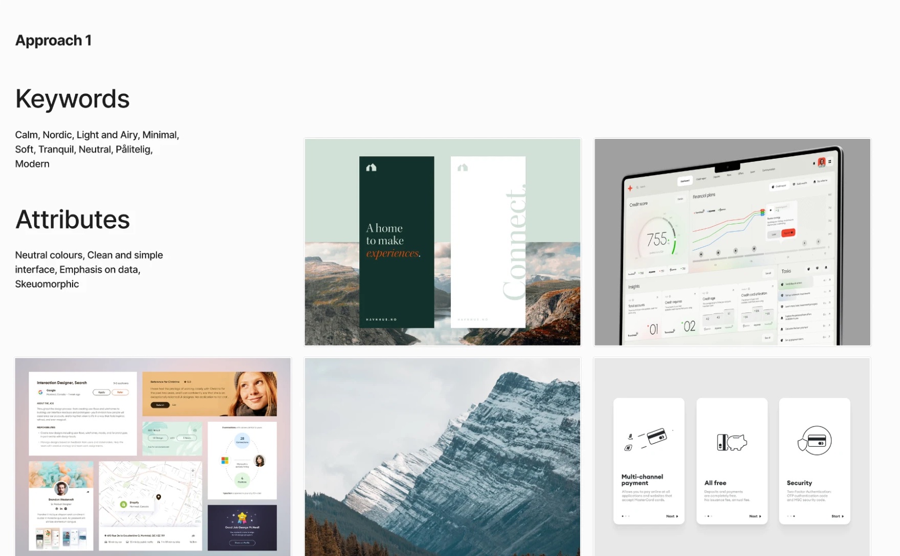
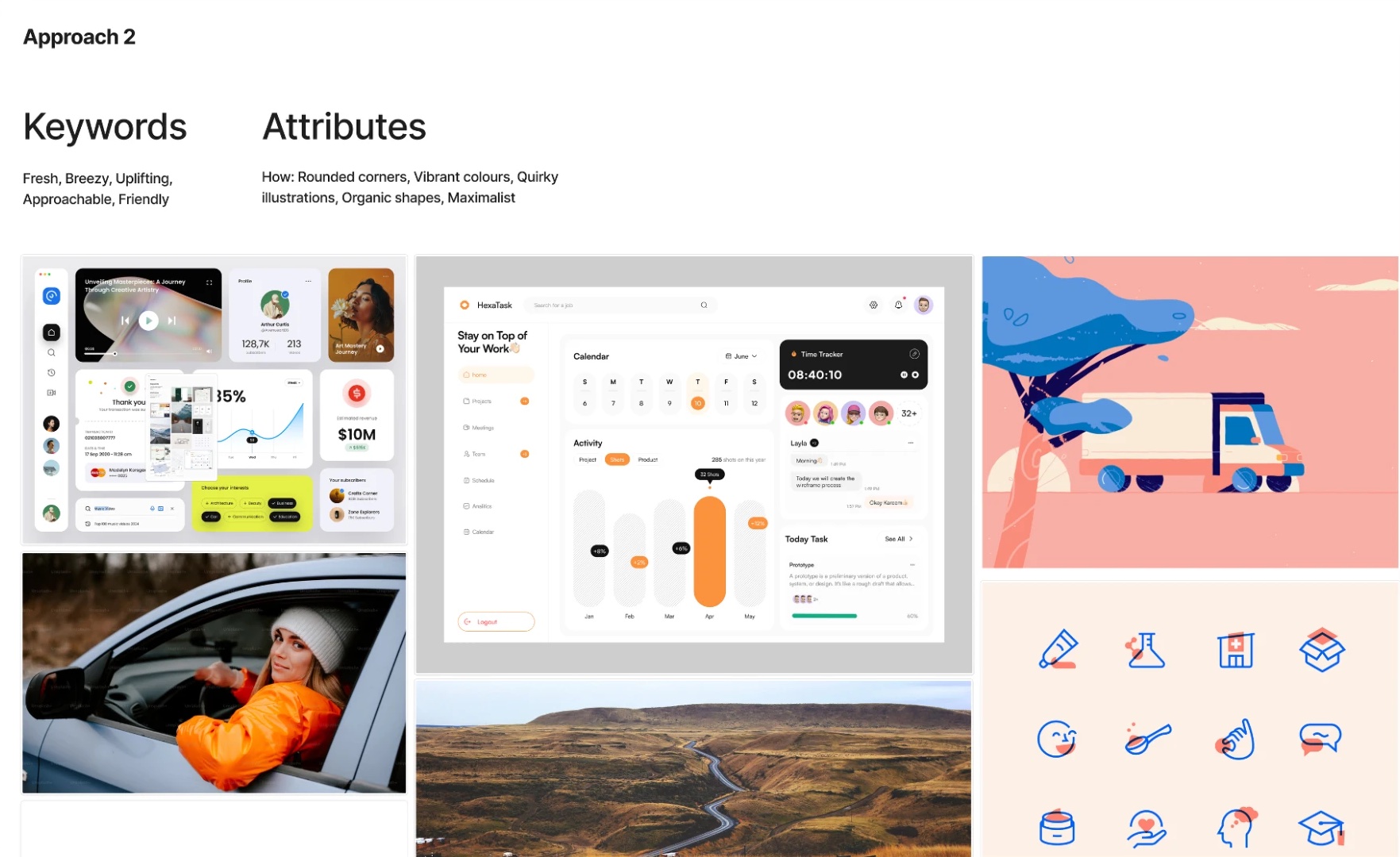
I worked with other designers and stakeholders in a collaborative workshop to explore ideas and align on goals. Using brand values and user feedback as guiding principles, I refined concepts through iterative reviews until we could lock a direction that balanced Statens Vegvesen’s identity with people’s need for clarity and accessibility.
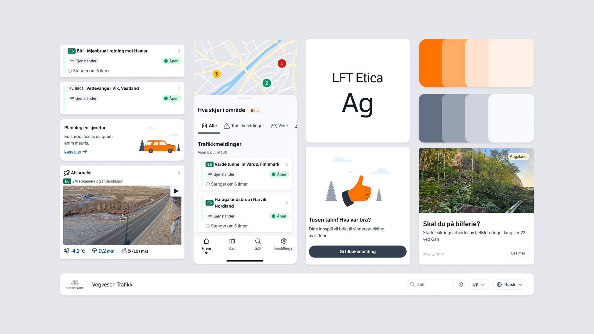
I created several UI directions for the Trafikk app, from early concepts to refined screens, and tested them with different user groups to check readability and inclusivity. Feedback from each round shaped the next, until one direction clearly stood out.
Foundations
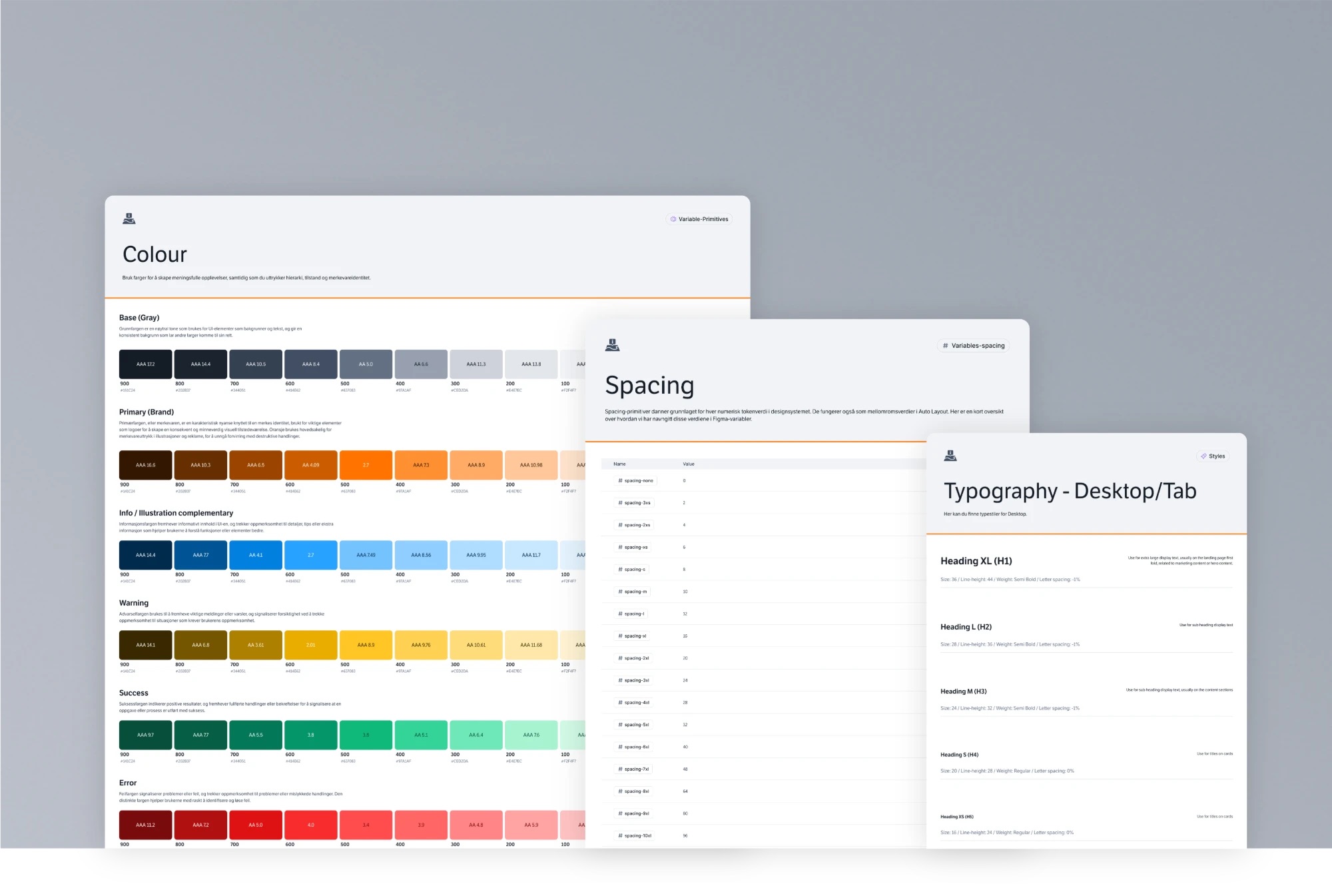
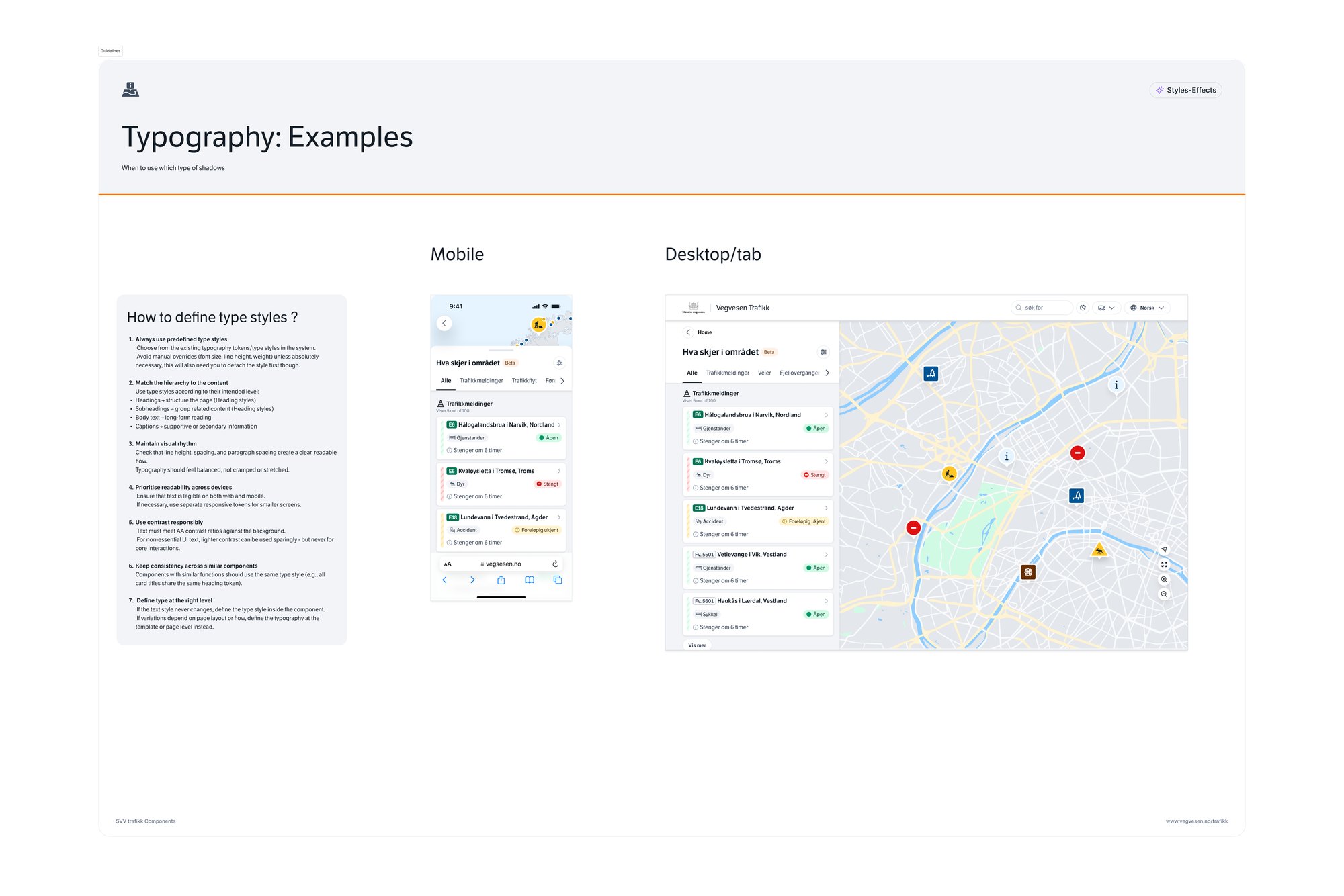
I redefined the core elements, including colour, typography, spacing and design tokens, to match the new direction, creating a cohesive, mobile-first design system.
Variables made the system adaptable in code, and semantic tokens made dark mode part of the foundation rather than a separate layer. Every component was built to be reused and to adapt between themes, so teams can apply them consistently.
Components
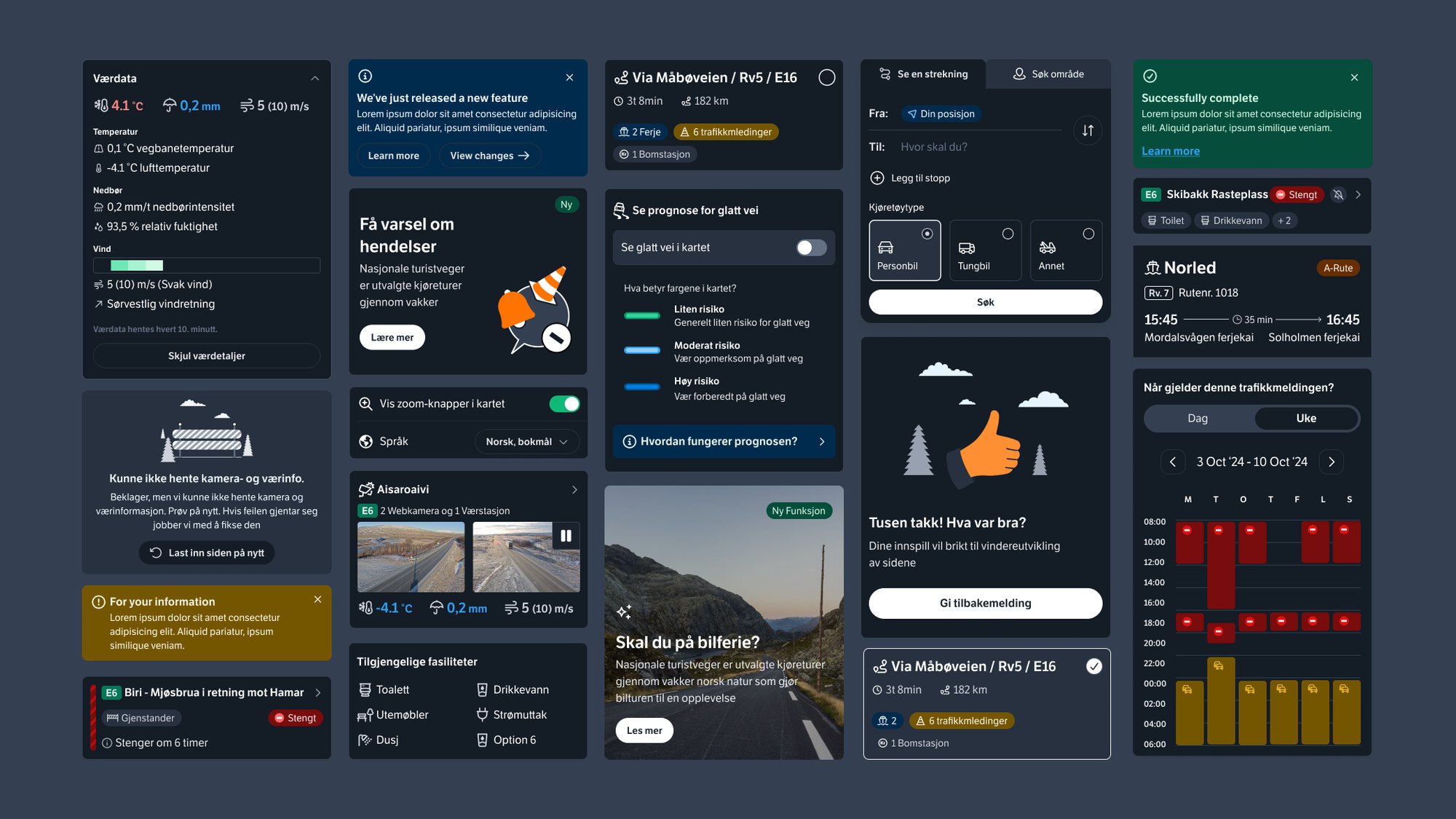
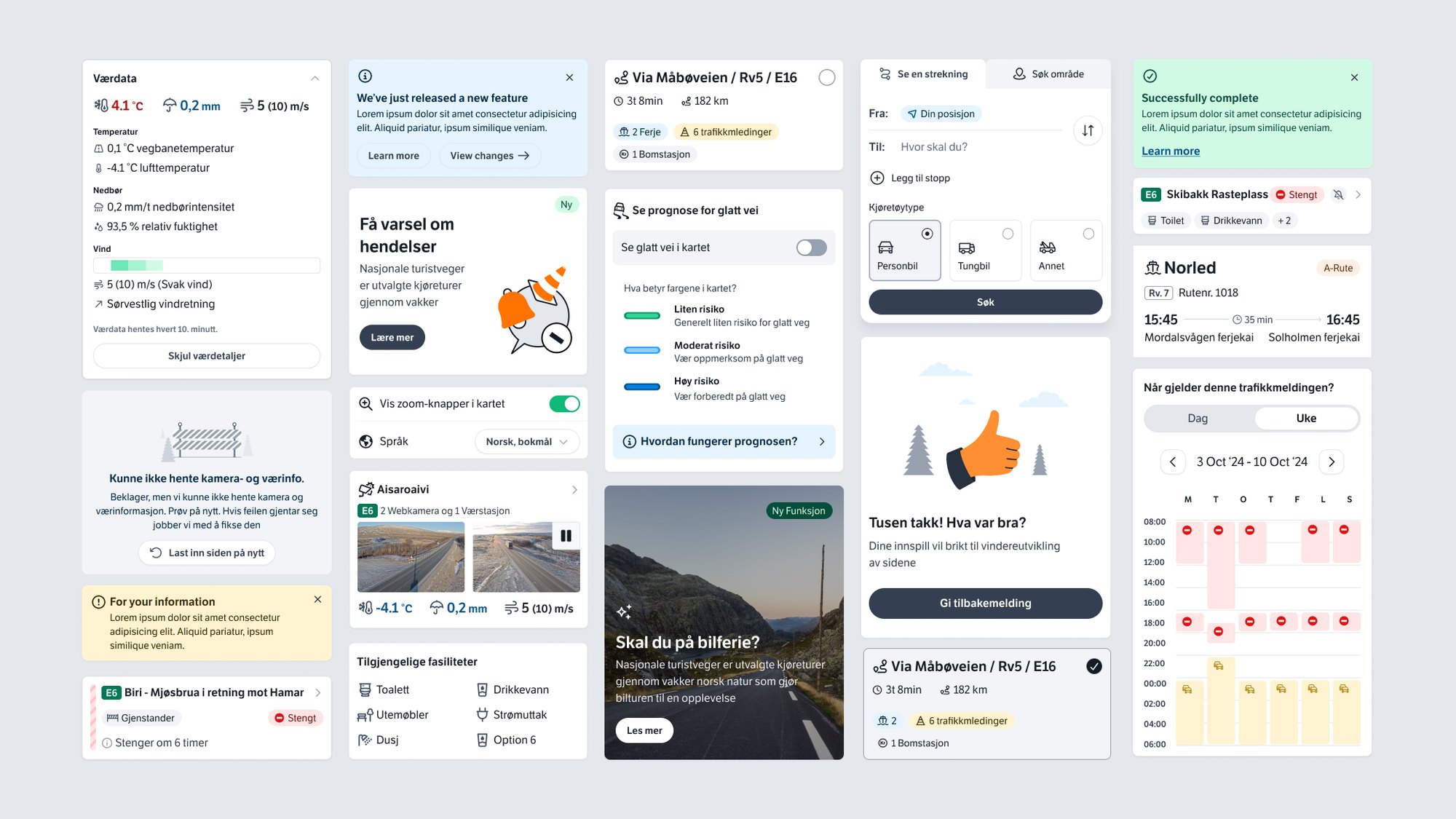
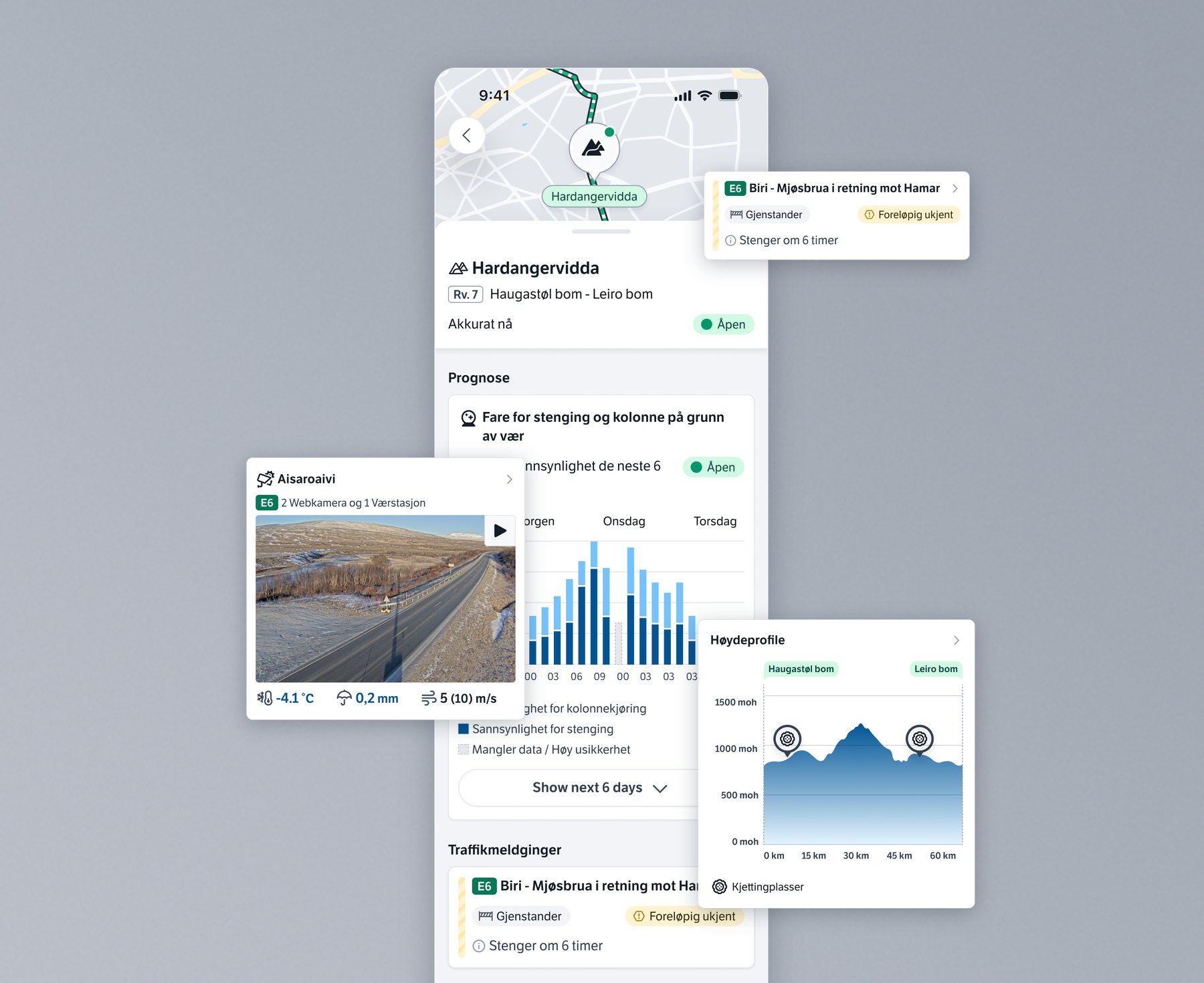
I redesigned each component around how people perceive and interact with information, establishing a clear hierarchy, making interactions intuitive and keeping things simple to reduce cognitive load. Data visualisations for road and traffic information were redesigned to be clearer at a glance.
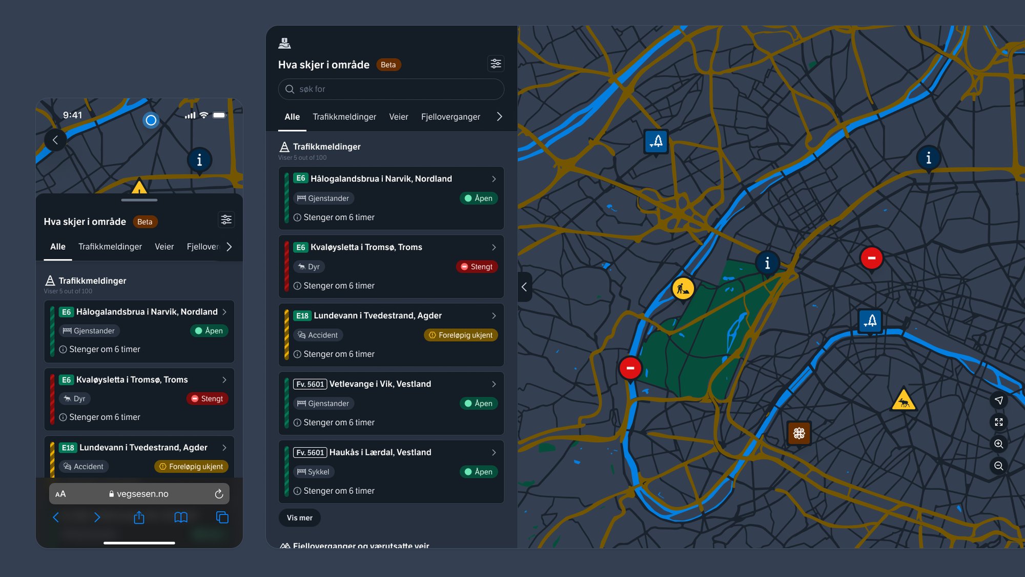
Dark mode was integrated at component level to support comfortable use in low light, so the experience stays consistent and familiar in any conditions.
I worked with the tech team to get the components developed in a React Strict DOM setup, so the library stays flexible and maintainable.
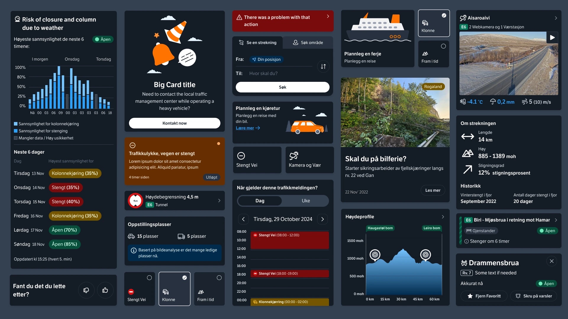
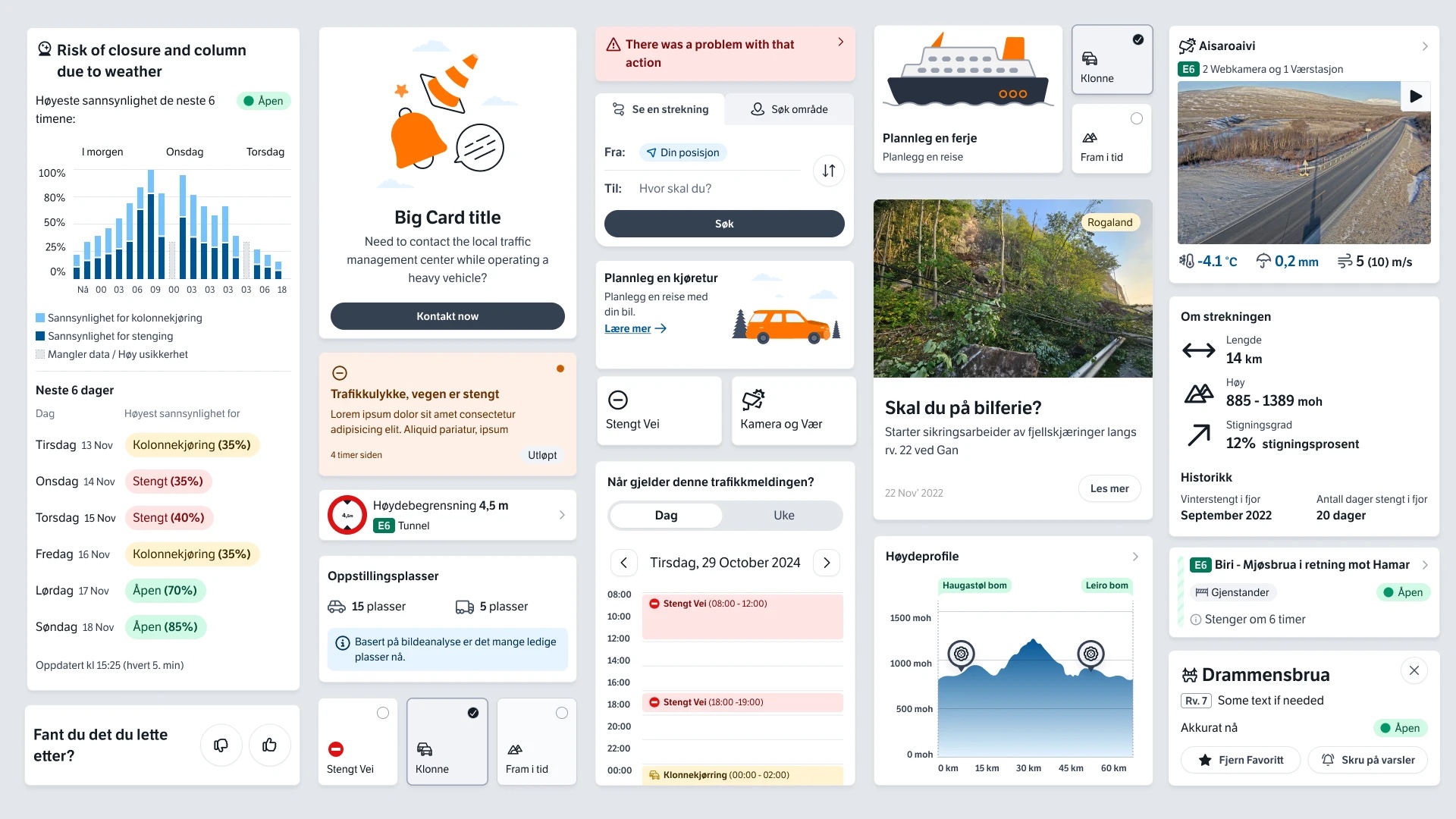
Map routes
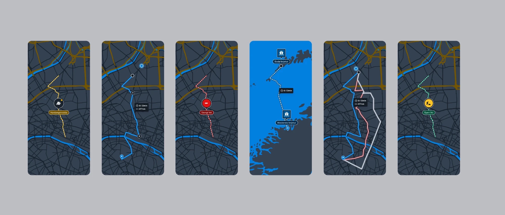
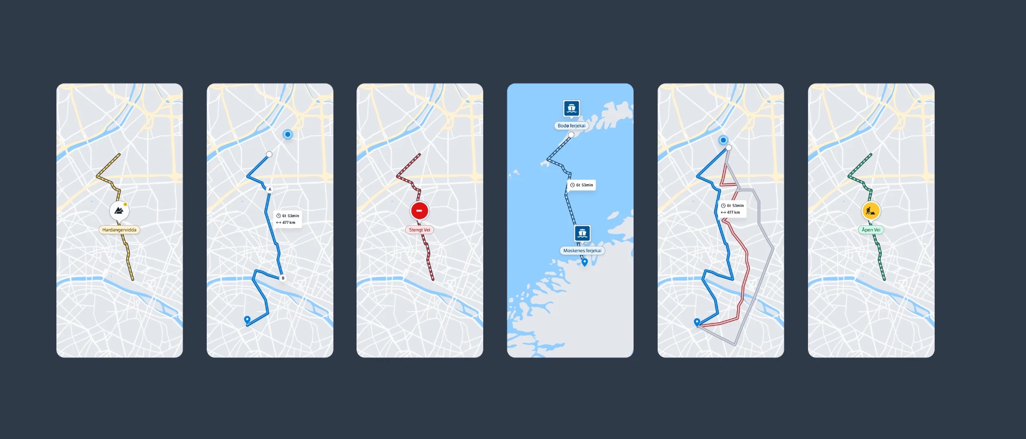
Road status also had to read clearly on the map. Striped lines mark stretches with a status, such as closures, roadworks and risk of closure, while solid lines mark stretches without one, such as national tourist roads and private roads. Routes, blocked routes and ferry routes each have their own style, in both light and dark.
Markers
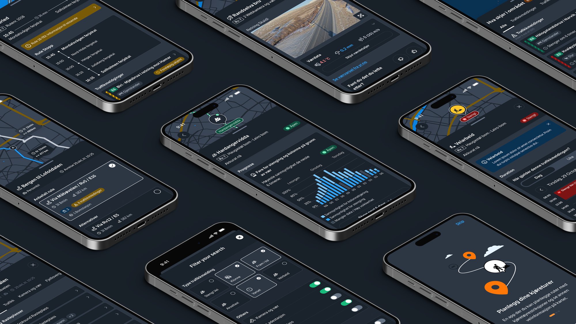
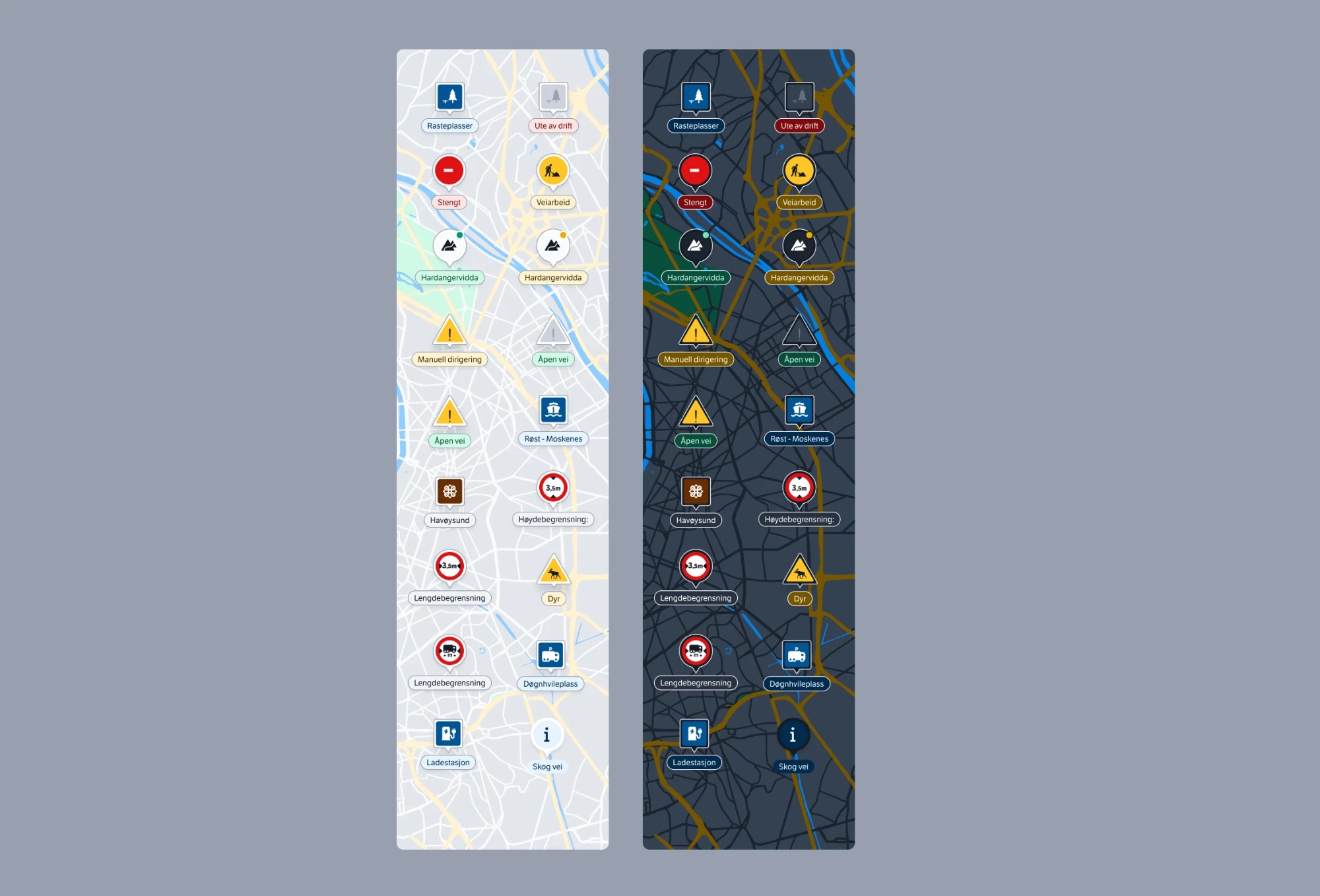
Map markers follow the same logic. Each one pairs a familiar road-sign icon with a label coloured by status, so closures, roadworks, mountain passes, ferries, height and length limits, rest areas and charging stations can be told apart at a glance, on both light and dark maps.
Key experiences
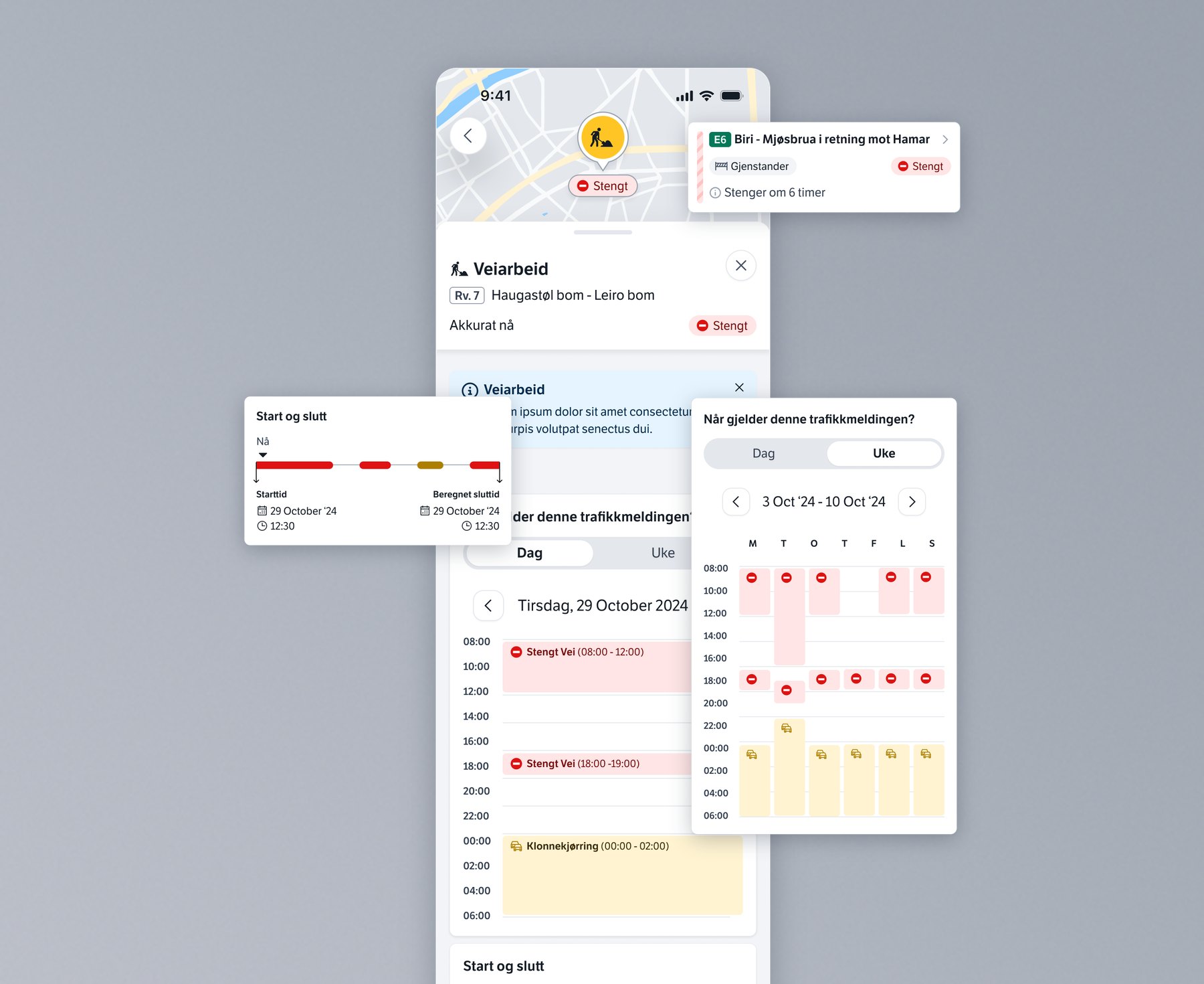
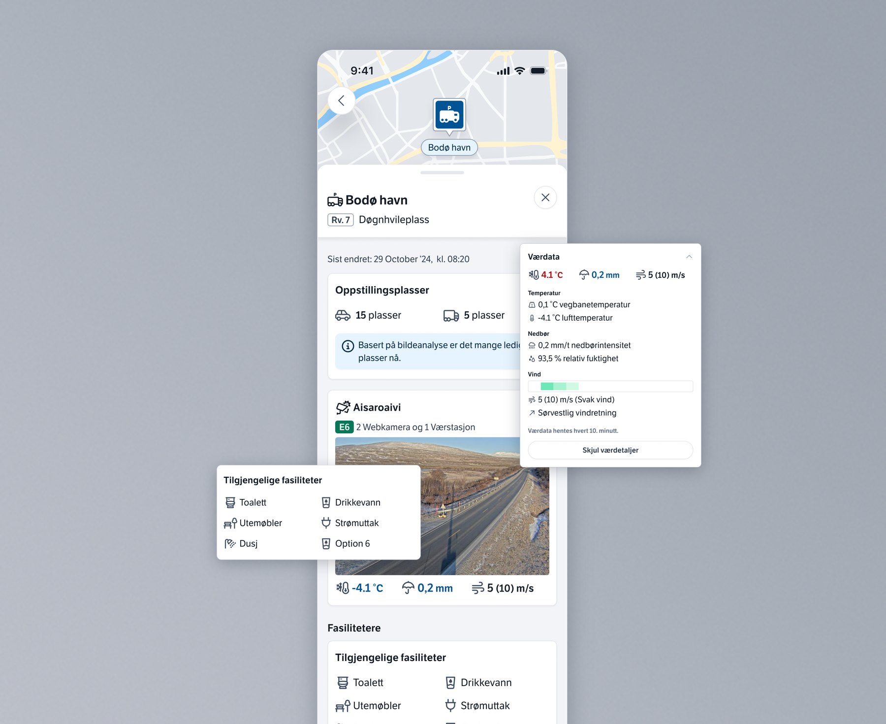
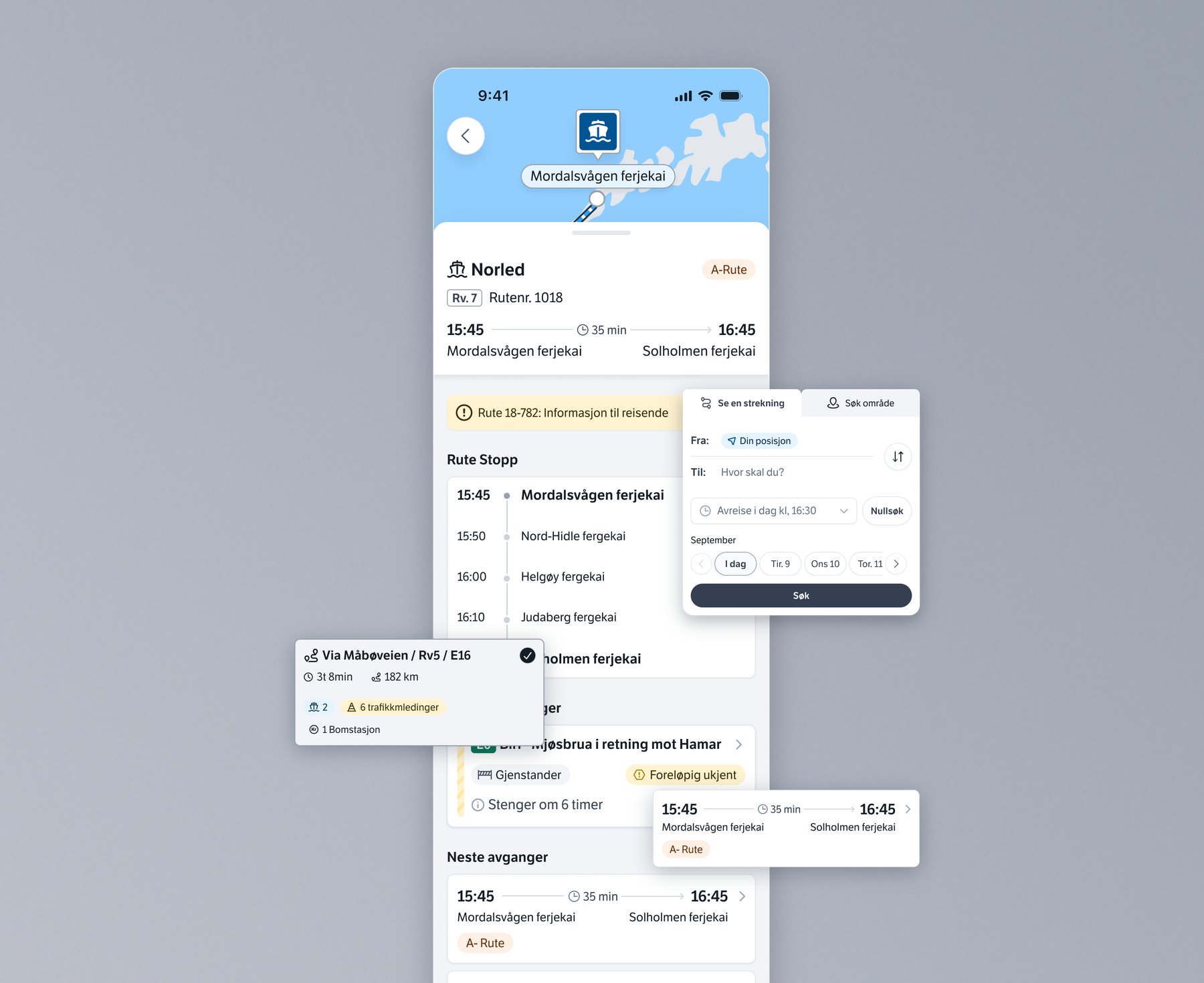
Results
A design system that makes traffic information clear, accessible and consistent across platforms, with dark mode for night-time driving and a scalable foundation for future updates. It also set a benchmark within Statens Vegvesen, inspiring other teams to adopt similar standards.
- Components designed, with variants for different states and built to adapt across platforms
- 50+
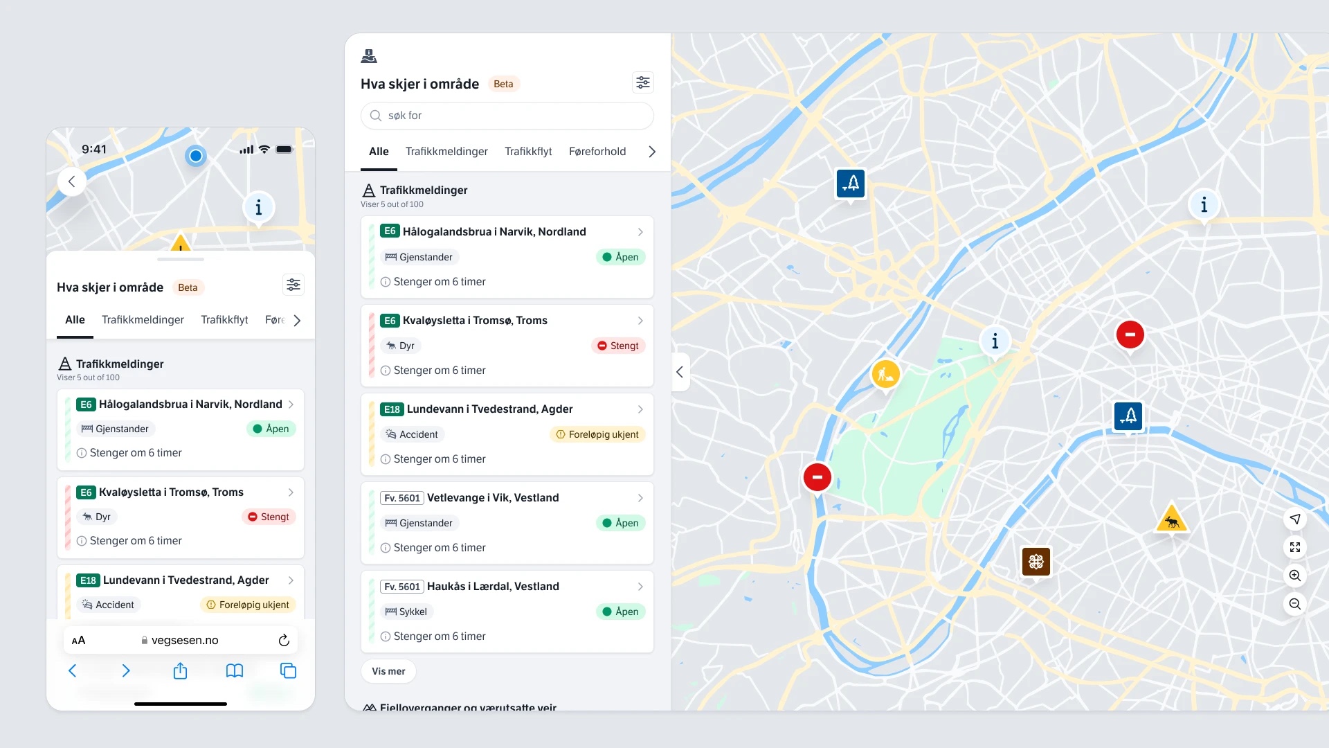
- Key experiences defined as templates, such as the map explorer, traffic messages and landing page concepts
- 15+
- Hybrid components developed in React, scaled for all breakpoints and built on design tokens
- 15+